Ameen Akbar
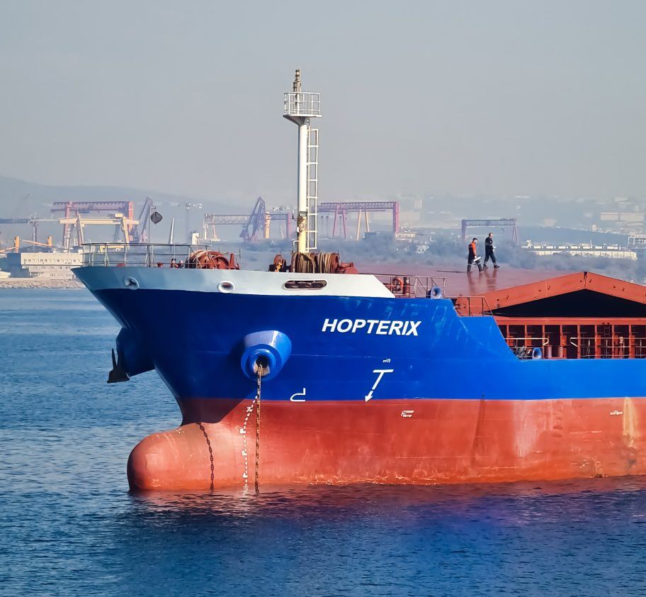
Cargo vessel at sea
Case study · SOL-X

Enhancing worker safety with heat stress sensing & analytics

SOL-X already tracked heat and alerted individual workers on their smartwatch. This is the story of turning that same data into a system supervisors and HSSE officers could act on too.

Role
Product design, UX strategy, research
Led
Research, journey mapping, prototyping
Team
2 PMs, 11 developers, 4 SMEs
Testing
4 sessions, 6 iterations
Client
SOL-X
Timeline
Q2 2022, 3 months
Platform
Smartwatch, dashboard, analytics cloud
Industry
Maritime & offshore (OAG)

Across 32 on and offshore sites, SOL-X was redefining safety in the maritime and OAG industry. Heat level monitoring and alerts are already live on the smartwatch. Dashboards show worker locations and geofences, but not heat exposure. An analytics cloud has been scoped as a platform for safety officers and management, but what it should show was undefined.

Supervisors manage the vessel and everyone on it from the bridge. HSSE officers prevent incidents across the fleet from ashore. For both roles, seeing how heat exposure impacts the crew adds a new lens to work.

Our goal was to help both groups make informed decisions and implement proactive, long-term safety measures.

Understanding working with heat

To understand the challenges faced while working in high heat environments, we had 1-on-1 chats with subject matter experts who had worked in the maritime & OAG sector. We also gathered feedback from users on vessels already using our solution, and observed users at one of the industrial sites that had recently started using it.

Why it matters
Working in high heat can result in dehydration, cause fatigue, and impact cognitive ability.
High heat exposure can impact physical and mental well-being. It can affect productivity and increase the chance of accidents.
Certain locations are known to have higher heat than others. The vessel's location and the weather both affect overall heat onboard.
High heat combined with high humidity has a higher impact on workers than high heat alone.

Three of these findings, in particular, each shaped a specific part of the solution:

Scroll to see all three →
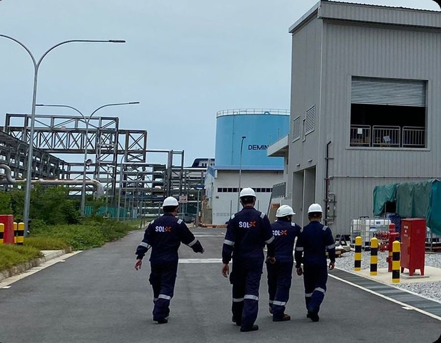
Team walking through an industrial site during a site visit
Full day on site: understanding how the team used SOL-X, and their work, behaviours, needs, and pain points firsthand.
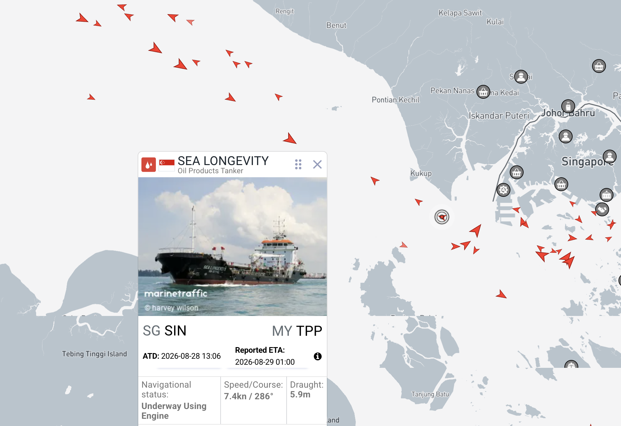
MarineTraffic showing vessel SEA LONGEVITY and surrounding ship traffic across the Singapore Strait
The vessel's location and the weather both affect overall heat onboard, especially outdoors.
Source: MarineTraffic
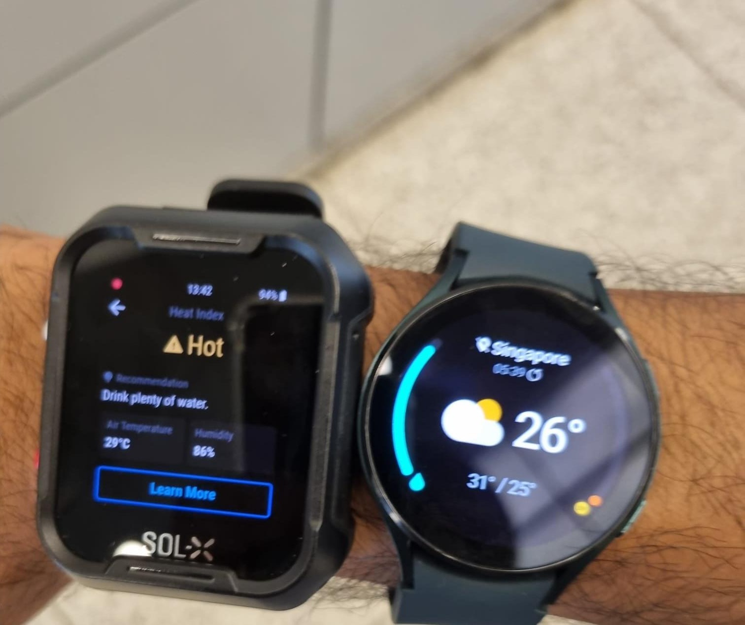
The previous SOL-X heat alert worn alongside a standard smartwatch, comparing heat index, humidity and hydration guidance against generic weather
Testing the existing alert on-wrist against a standard smartwatch. One reads heat index, humidity, and hydration guidance. The other reads the weather.
Workers already got high heat alerts on the watch, but found repeated alerts distracting. They cared more about the accuracy of the reading than acting on it, and could be too focused on the task at hand to notice continuous exposure.
→ Drove the watch redesign
If a worker suffers from heat stroke while working in isolation, the rest of the crew might not know what has happened for a long time.
→ Drove the Halo indicator
For HSSE officers on shore, capturing wellbeing-related information is currently limited to a few channels.
→ Drove the analytics cloud

One connected safety experience

This heat data now needed to serve three different users, each with their specific goals: workers around the vessel or site, a supervisor on watch, and an HSSE officer on shore. All needed something different from the same data.

At the moment workers who work through repeated heat alerts have no safety net until a fall or crew-assist signal fires. We mapped a to-be flow that connects all three roles. A supervisor has visibility of workers with high-heat exposure and gets an early alert of prolonged exposure, while an HSSE officer can review compiled reports to enhance safety training, ventilation and PPE going forward.

To-be · Worker, Supervisor and HSSE Officer, connected
To-be flow diagram showing how a Worker's heat alert connects to the Supervisor's dashboard and feeds the HSSE Officer's fleet-wide reports

Designing inside technical limits

We had to work within certain constraints as we designed for users across the watch, dashboard and analytics cloud.

Data upload cost

Given the quantity of data points, and the cost of uploading via VSAT, data uploads from each vessel to the cloud would be limited to only once a day.

Level of detail on reports

All data would not be shown in the charts, as high granularity would impact performance. Only data aggregated daily would be used. This meant the highest level of detail would be by day.

Data privacy

For legal reasons, we could not individualise data captured by users' wearables, so we anonymised this by only providing their rank groups.

Map limitations

From the way our maps had been built, it wasn't possible to show heat readings in each zone. We had to decide between creating a new map element or using existing elements to show heat.

Balance between clarity & completeness

A comprehensive view risked overwhelming users, while condensed summaries risked hiding details. We balanced the two with a step-by-step drill-down approach.

From the deck to the dashboard

We built storyboards of the to-be solution so stakeholders could see it end to end before it was built.

Scenario: Ben is an engineering officer on board the Helsinki LNG tanker. He's been assigned maintenance work on the deck. Captain Joshua is the officer on watch at the bridge at this time.

From alert to action, across three surfaces

Scroll to see all three surfaces →

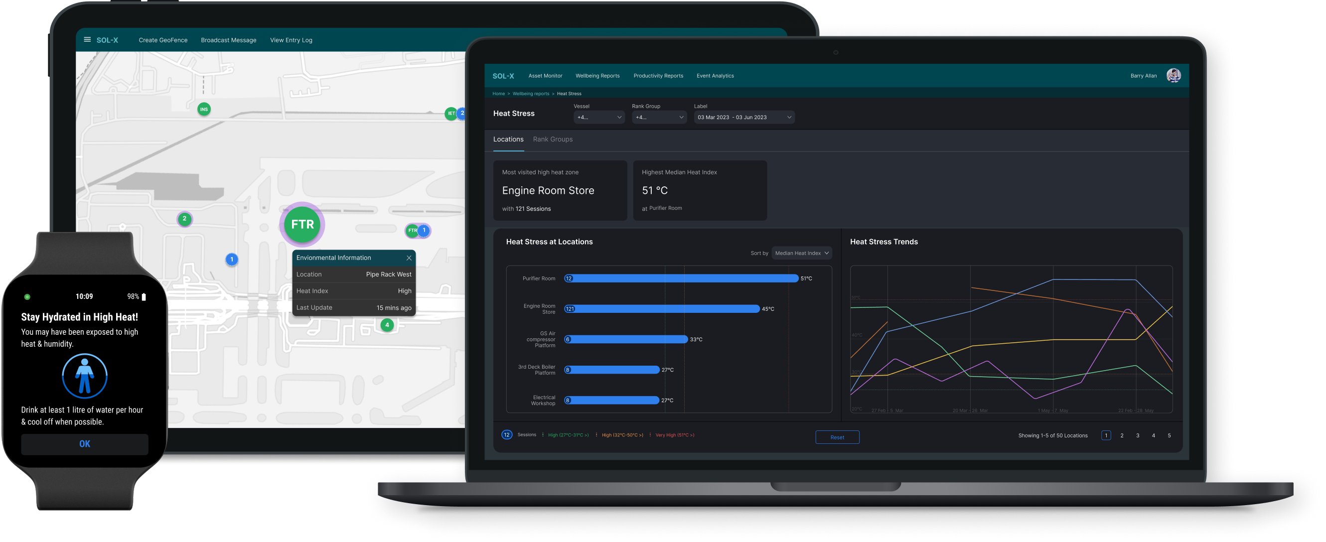
SOL-X across three surfaces: a smartwatch showing a hydration alert, a supervisor dashboard with the Halo indicator, and an analytics cloud dashboard on a laptop

The same heat data, tailored to what each role actually needs to see.

Rethinking high heat alerts on the smartwatch

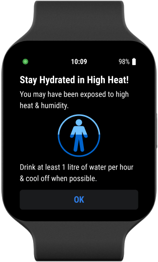
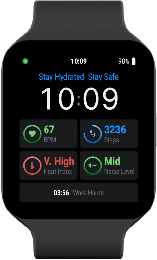
On the watch, the focus shifted from a high-heat reminder to a hydration reminder. This moves the message from what's happening to guiding the user on what to do next.

Repeated heat alerts were flagged as disruptive by some users, so the system now lets them be muted. A blinking indicator stays on the watch face regardless, remaining visible until heat levels return to an acceptable range.

Smartwatch alert reading Stay Hydrated in High Heat, with instructions to drink at least 1 litre of water per hour
The initial heat alert
Smartwatch face showing a persistent Stay Hydrated, Stay Safe message alongside heart rate, steps, heat index, noise level and work hours
The persistent watch face reminder

Designing the high-heat indicator on the dashboard

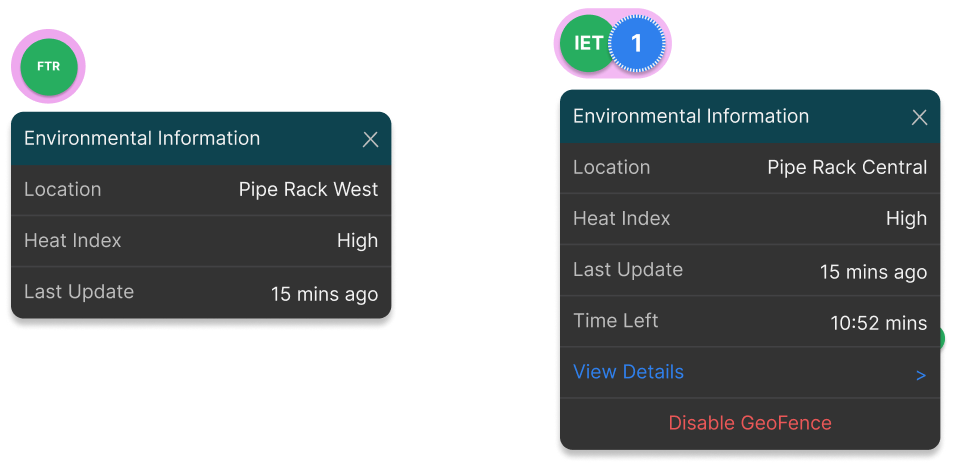
It wasn't possible, based on how the map had been built, to link zones directly to heat readings. The challenge was making heat visible enough without overcrowding the map. We designed the "Halo," a visually clean, intuitive representation of ambient hazards around the existing worker and geofence markers, without adding visual noise.

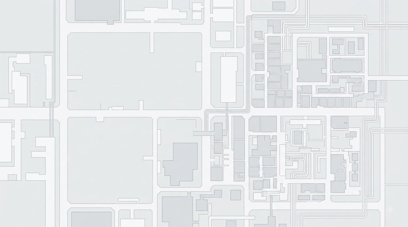
Abstract site map, representative of the dashboard's map view Worker and geofence markers with Environmental Information popups showing location, heat index, last update, time left in zone, and options to view details or disable the geofence
The Halo indicator surfacing environmental information (location, heat index and time left in zone) around worker and geofence markers on the map.

Designing heat stress analytics on the cloud

The analytics dashboard shows an overview and insights of heat stress across all vessels managed by each user. Users can identify and prioritise specific vessel locations and crew rank groups, surfacing trends that support proactive, long-term safety measures.

Live, at scale

This solution is currently being used on:

0+
LNG/COT vessels
0+
Smartwatches worn by seafarers
0+
Dashboards at vessel bridges
0+
Analytics portal users
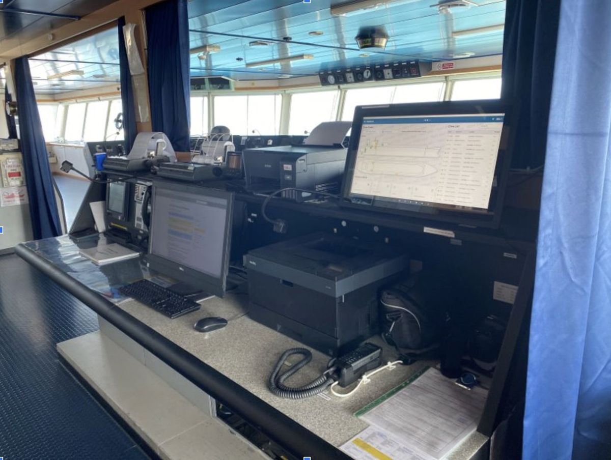
SOL-X dashboard running live on a vessel bridge monitor
The dashboard, live on a vessel bridge.

Where this could go next

Several enhancements are needed so users can maximise the benefits from these solutions.

Filter out inaccurate or faulty data. Damaged heat sensors (e.g. 400°C) or water clogging the watch and blocking the sensor membrane can distort insights with high or inaccurate readings.
Prioritise alerts on dashboard & watch. Prevents notification fatigue for workers and supervisors as more hazard types beyond heat, like noise and heart rate, are added.
Asset management dashboard. Lets users directly view all hazards of each vessel in a single view.
Cold report. Similar to the heat stress report, since working in cold environments is a safety hazard too.
Location specific heat history. Lets dashboard users view heat patterns for each location, using heat data captured from crew watches.

What this taught me

This project was about designing three solutions for three distinct personas from the same underlying signal. A worker needed an action-first alert. A supervisor needed situational awareness before sending someone into a hazard. An HSSE officer needed to understand patterns across weeks and vessels.

The "Halo" indicator was particularly challenging to build within constraints. The map couldn't be rebuilt, so the solution had to work with the geofence and worker markers that already existed.

More broadly, this project reinforced why shifting from a reactive to proactive mindset mattered. A system that tells a worker they're overheating is different from one that helps a supervisor prevent it and an HSSE officer plan around it entirely.