Ameen Akbar
Aerial view of Gardens by the Bay and Marina Bay, Singapore
Case study: Singapore Airlines

Revitalising inbound travel to Singapore on the SQ mobile app

Rebuilding travellers' confidence in visiting Singapore, and in booking through the Singapore Airlines app after a long hiatus in travel from Covid lockdowns.

Role
Product design, UX strategy, research
Led
Research, ideation, prototyping
Team
1 PM, 2 developers, 1 designer
Testing
7 sessions, 4 iterations
Client
Singapore Airlines mobile app
Partner
Singapore Tourism Board
Timeline
Q3 2020
Platform
iOS, Android

When COVID-19 struck, Singapore's travel and tourism industry took a heavy blow. In partnership with the Singapore Tourism Board, we set out to rebuild traveller confidence and help revive the local businesses that depended on visitors returning.

These were some of the first travellers back after two years of closed borders. Starting to travel again, when entry rules were still in flux and international travel felt unfamiliar. The brief centred on rebuilding confidence in travelling to Singapore.

Our goal: help travellers to Singapore plan their trip by showing STB recommended places, events and activities.

Finding the right moment of value

We needed to know where in the travel journey this feature would matter most to SQ travellers. Would it inspire someone to book a trip to Singapore, or support travellers already planning, or already in, the country? We took both a qualitative and quantitative approach.

On a monthly survey

We asked: "Which of the following sources or influences have had the most significant impact on fuelling your desire to travel?"

When interviewing users

As a warm-up question during usability testing, we asked: "Can you describe a specific time when you felt a strong longing to embark on a journey? What factors or influences contributed to this desire and motivated you to explore new destinations?"

Two themes came up again and again:

Time spent at home shifted people toward social media and TV, sparking a desire to travel that rarely carried over into using travel apps themselves.
Recommendations from friends and colleagues carried real weight in deciding where to go.
Both data sets agreed: inspiration came from other people and passive media, not deliberate research. The feature couldn't rely on being found; it had to meet travellers who'd already arrived with intent.

Looking at how other travel apps handle discovery

We studied how other travel apps handle discovery, sharing the strongest examples at the ideation workshop to prime participants going in. A few patterns stood out:

Search-first navigation with clear category filters (Things to See, Food, Activities) made it easy to narrow a large catalogue down fast.
Several apps led with a curated "must-see" list rather than a raw search bar, giving undecided travellers a confident starting point.
Booking-led apps like Expedia surfaced a persistent "Your trips" dashboard, blending inspiration and logistics in one place.

Gathering ideas across the whole journey

How do we help travellers feel confident at every stage of getting to Singapore, when travel doesn't feel routine anymore?

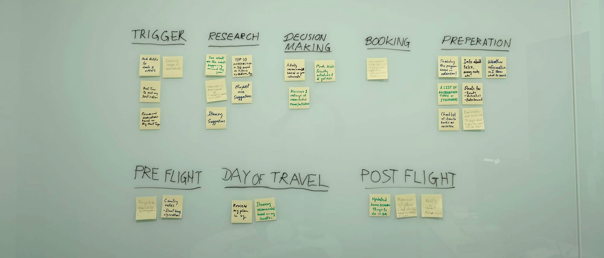
We ran an ideation workshop with 8 participants from different demographics, sorting ideas into buckets for each stage of the travel journey (from the initial trigger through to post-flight) so each one could be mapped to exactly where it would matter.

Photo of the physical sticky-note board from the ideation workshop, with ideas grouped into columns for Trigger, Research, Decision Making, Booking, Preparation, Pre-flight, Day of Travel, and Post-flight.

Placing the feature at the right moment

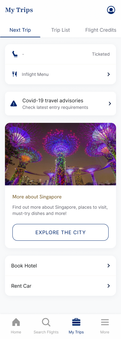
We placed the feature after a traveller had a confirmed booking to Singapore, which meant it belonged in "My Trips," alongside other contextual planning tools, staying available for the whole trip.

Early testing pointed to the homepage as the entry point with the widest reach. But our own research showed travel apps weren't where inspiration was happening during this period. My Trips reached a smaller audience, but one that had already committed to travelling to Singapore.

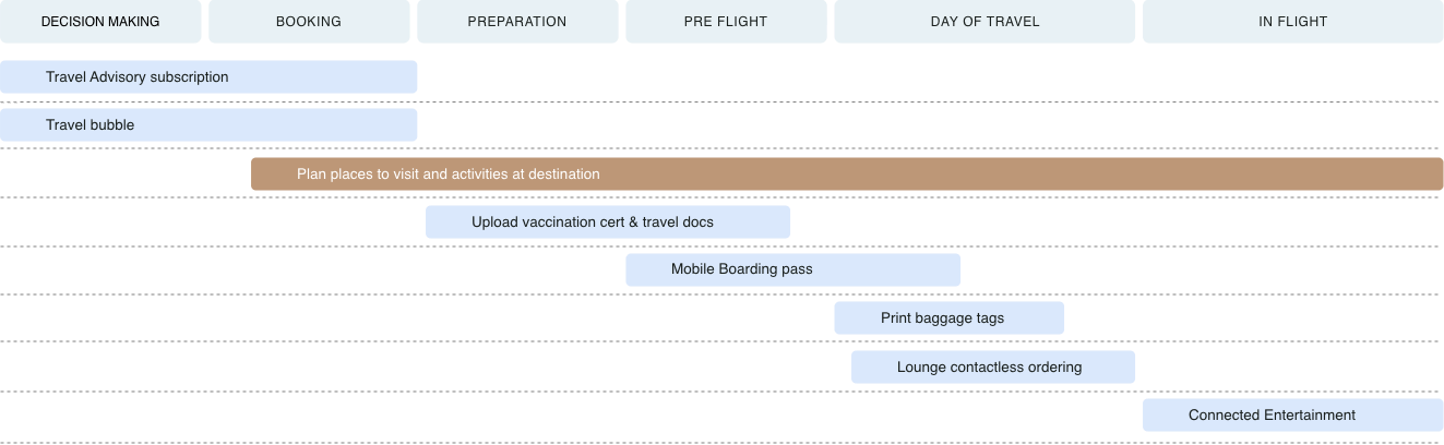
Ideas mapped across the travel journey (Decision Making, Booking, Preparation, Pre Flight, Day of Travel, and In Flight), with 'Plan places to visit and activities at destination' highlighted as the selected feature.

Two limitations we had to design around

Because this feature relied on an external tourism API, two constraints shaped the design early.

Seamless integration with tourism APIs

Early technical tests with developers mapped what the API provider could actually deliver: the available data, and how reliable the service was.

Data availability and freshness

Rather than showing everything the API returned, we applied a freshness cutoff, excluding any listing that hadn't been refreshed recently, so travellers wouldn't be shown outdated or incomplete content passed off as current.

Designing within an existing system

We reused SQ's existing design system instead of inventing new components, using the same patterns our users were already familiar with.

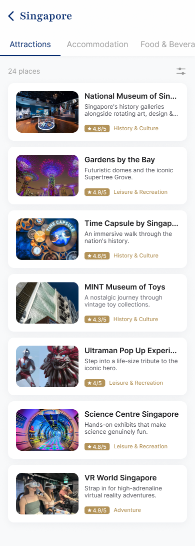
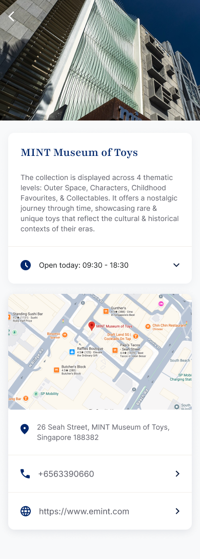
The feature surfaces inside "My Trips" as a contextual entry point once a user has a confirmed booking to Singapore. From there, users can browse a curated listing of places and activities, drill into a details screen for each one, and jump straight into Google Maps for directions or the native dialler to call ahead and check availability.

Right feature, right people

Because the tourism content came from an API tied to confirmed Singapore bookings, the feature could only activate for travellers who already had a flight booked to Singapore, which shaped both the technical approach and how we measured success.

40%

of travellers flying into Singapore engaged with the feature once it activated on their confirmed booking: a strong adoption rate for a net-new, opt-in discovery feature that nobody had to go looking for.

~32%

of engaged travellers returned to the feature more than once across their trip (pre-flight, day-of, and post-flight), reinforcing that placing it in "My Trips" kept it relevant throughout, not just at the point of booking.

~18%

of engaged travellers tapped through to a listing's phone number, Google Maps, or website: strong intent to visit, and the closest signal we had to the Singapore Tourism Board's own goal of driving footfall to local businesses.

Adoption is measured among users with a confirmed booking to Singapore (the only segment the feature could activate for), and is confirmed against deployment data. Return-visit and outlink-click figures are approximate, pending final confirmation.

Where this could go next

A few enhancements were scoped but not built:

Collaborative planning

Saving and sharing activities and places with travel companions, turning solo browsing into collaborative trip planning.

Local partnerships

Partnerships with local services in other destinations, extending the same listings beyond Singapore.

Personalisation

Personalised recommendations based on users' travel history, e.g. solo vs. family travellers, previous activities, dietary preferences.

Reflections

This project sharpened how I think about designing for a moment that hasn't happened yet. We weren't optimising an existing behaviour; we were trying to rebuild a traveller's confidence and desire to travel, from inside an app they'd open for entirely different reasons, like managing a booking or checking in.

Relying on an external API meant designing for uncertainty from day one, without that ever becoming the user's problem to notice. Gating activation to a confirmed booking felt like a constraint at first, but it turned out to be the right choice, keeping the feature relevant to everyone who saw it.

A simple discovery feature turned out to depend entirely on the decisions around it: where it sits in the journey, and what data it can rely on.